
You don't need to be a designer to make good design decisions. These five principles guide most of the visual decisions we make in every project.
You Don't Need to Be a Designer
Good UI/UX is mostly about understanding how people read, navigate, and make decisions — not about taste. These five principles cover 80% of the design decisions we make in every project.
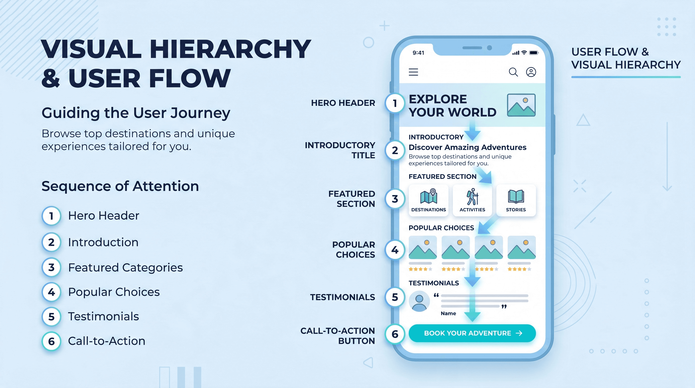
1. Visual Hierarchy First
Every screen has one most important thing. Make it obvious. Use size, contrast, and spacing to create a clear reading order. If you squint at a screen and can't tell what you're supposed to do, the hierarchy is broken.
Practical: Increase the font size and weight of your primary heading. It should be noticeably larger than everything else on the page.
2. Whitespace Is Not Wasted Space
Crowded layouts feel untrustworthy. Generous spacing gives elements room to breathe and makes content easier to scan. Every professional-looking design uses more whitespace than you think.
Practical: Double the padding around key content blocks. Notice how much more readable it becomes.
3. Consistent Interaction Patterns
Users form expectations fast. If links are blue and underlined on one page, they should be blue and underlined everywhere. Inconsistency forces people to relearn, which creates friction.
Practical: Define a single style for each interactive element type and stick to it across the entire app.
4. Mobile-First, Always
More than 60% of web traffic is mobile. Designing desktop-first and then shrinking it down always produces compromised mobile layouts. Start with the small screen and expand up.
Practical: Build and test on mobile before touching the desktop layout.
5. Error States Are Part of the Design
Most developers design only the happy path. But error messages, empty states, and loading states are just as visible to users. A good error message tells users what went wrong and what to do next.
Practical: For every form field, design an explicit error state with a helpful message. For every data fetch, design a loading and empty state.
The Bottom Line
You won't become a designer overnight, but applying these five principles will make your work noticeably better. Most UI problems trace back to one of these five issues.
Fatima Syed
Founder of Pioneer Developer & Full-Stack Developer. Writing about web dev, mobile apps, and building digital products that work.
Have a Project in Mind?
We work with startups and businesses worldwide. Let's talk about what you want to build.
Start a Project