

Managing social media for a client whose aesthetic sense doesn't match yours? Here's what I'm learning about resolving aesthetic disagreements and finding alignment.
I want to write about something I'm actually dealing with right now, not a lesson I've already learned and packaged up nicely. This one's still unresolved. I'm figuring it out as I go, and maybe writing it down will help me — and if you're a social media manager who's hit the same wall, maybe it helps you too.
When a Client's Brand Aesthetic Conflicts With Your Own
I'm currently managing social media for a client, and we work well together. We both want this partnership to succeed. Neither of us is being difficult on purpose. But we are stuck on something that turns out to be surprisingly hard to talk about: our aesthetic sense doesn't match.
Here's what that actually looks like in practice.
He's built something real — his work, his product, his craft. And when it's time to post, what he wants is simple: *show people what I made.* Big, clear, unfiltered. The work is the content. To him, anything else — a template, a layout, a color system, a "brand aesthetic" — feels like a filter standing between his work and the person looking at it. He's not wrong that his work is the point.
I come at it from a different angle. I think about the scroll. I think about the three seconds someone spends deciding whether to stop or keep swiping. I think about consistency, visual identity, whether a feed looks like *something* when you land on a profile for the first time. To me, a well-designed template isn't hiding the work — it's what gets people to actually stop and look at it in the first place.
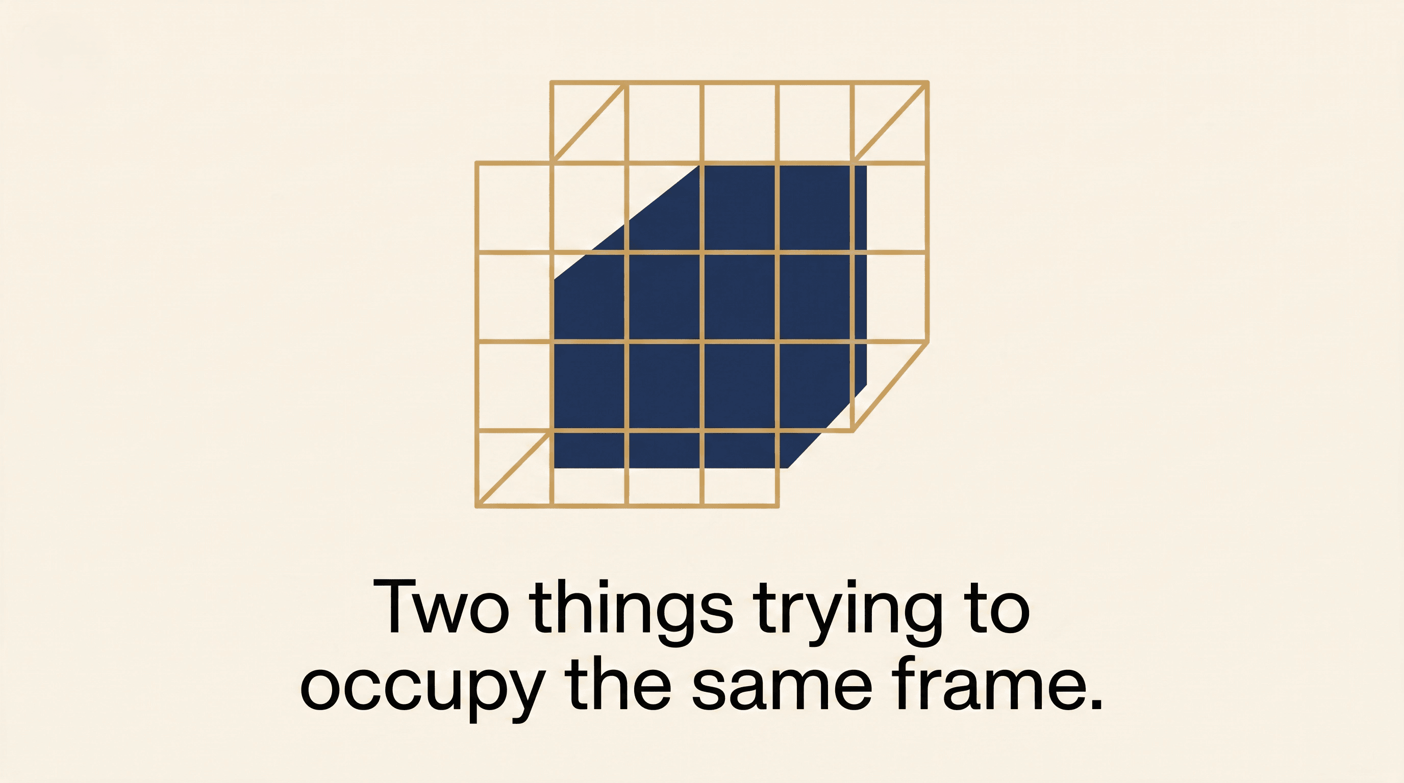
The real conflict: It's not about taste — it's about content purpose. We're not disagreeing about whether his work is good. We're disagreeing about what's *in service of* showing it well. He thinks the content's job is to document the work as honestly as possible. I think the content's job is to get someone who doesn't already care to stop and look.
So every time I send him a design, he says it feels like it's covering up what he made. And every time he sends me a raw, template-free photo of his work, I feel like we're leaving attention on the table.
Why Aesthetic Disagreements Are Hard for Social Media Managers
If you've never managed someone else's brand, this might sound like a small thing to fix — just compromise, right? But aesthetic disagreements are weirdly personal. They're not like disagreeing on a posting schedule or a caption length, where there's a clear "better" answer you can point to with data. Aesthetics feel like taste, and taste feels like identity. When he says he doesn't like my template, it's easy for me to hear "you don't understand my brand" even if that's not what he means. And when I push for more design, he might hear "your work alone isn't enough," even if that's not what I mean either.
Neither of us is saying that. But that's the emotional undertow of an aesthetic disagreement, and I think that's why it's harder to resolve than most client friction. It's not a logistics problem. It's a trust problem wearing a design problem's clothes.
How to Resolve Client Aesthetic Conflicts: What I'm Learning
A few things have shifted in how I'm thinking about this, even without having solved it yet:
It's two different theories about content purpose, not taste. He thinks the content's job is to document the work as honestly as possible. I think the content's job is to get someone who doesn't already care to stop and look. Both of those are legitimate goals — they just pull in different visual directions, and neither of us has clearly said out loud which one we think matters more right now.
I've been designing for an audience of one. Some of my pushback on his raw photos has been about what looks good to *me*, not necessarily what performs best for *his* audience. My aesthetic may not be his audience's aesthetic — and that's a rule I'd tell any other client, so I need to actually apply it to myself here too.
We've never actually agreed on what winning looks like. Not once have we sat down and said "here's the goal for this account — is it brand recognition, is it direct inquiries, is it just documentation for a portfolio." We've been arguing about *how* to get somewhere we never named.
Practical Steps for Social Media Managers Facing Aesthetic Disagreements
I don't have this fully solved yet, but I've stopped treating it as a debate to win and started treating it as a design constraint to work within. A few things I'm putting into practice:
Name the goal before naming the aesthetic. Before I open a design tool again, we're sitting down and agreeing on one sentence: what is this account actually for right now — brand recognition, direct inquiries, or a living portfolio of the work. Once the goal is named, a lot of design decisions stop being about taste and start being about which choice serves that goal.
Let the work stay the hero — design the frame, not the photo. Instead of full templates with graphics and text blocks sitting on top of his work, I'm shifting to a much lighter system: one consistent crop ratio, one caption font, one color grade applied consistently across posts. The work fills 80–90% of the frame. The "design" is just enough structure to make the grid feel intentional.
Split the content by job, not by compromise. Raw, unfiltered documentation of the work can live in Stories and Reels, where immediacy is the whole point. The main feed gets the slightly more considered, consistent treatment. Neither of us has to "win" on every single post if we agree on which format each style belongs to.
Test it instead of arguing about it. Performance isn't opinion. I'm proposing we run a few weeks where we post a mix — some raw, some lightly designed — and actually look at what the audience responds to, not what either of us personally prefers.

Finding Alignment When Client Aesthetics Don't Match
None of this is a guaranteed fix, and I'm not pretending it is. But I suspect the real answer isn't me winning him over to "my" aesthetic, or me abandoning design and just posting raw work. It's probably somewhere neither of us has drawn yet — a visual language that still lets his work be the obvious hero of the post, but gives it just enough structure that it doesn't get scrolled past.
> The work is the message. Design's only job is to make sure it gets read.
If You're Facing the Same Client Aesthetic Challenge
If you're mid-disagreement with a client over aesthetics today, here's where I'd start:
1. Ask one question before you design anything else: "When someone sees this post, what do you want them to feel before they even read the caption?"
2. Say the goal out loud, together. Brand recognition, inquiries, or portfolio — pick one for right now. Most aesthetic fights are actually goal fights wearing a design costume.
3. Design the frame, not a layer on top of the work. One crop ratio, one color grade, one caption font. Let the work fill the frame.
4. Split formats by job. Raw and unfiltered belongs in Stories and Reels. Considered and consistent belongs in the main feed.
You don't have to resolve this in one conversation. I haven't. But asking the right question first is a better starting point than sending another design and hoping this one lands.
If you're facing this same wall — where you both want the account to succeed, but you're pulling in different visual directions — I'd genuinely like to hear how you worked through it. This one's still in progress for me.
Fatima Syed
Founder of Pioneer Developer. Full-stack developer and social media strategist helping businesses build digital products and grow their online presence.
Have a Project in Mind?
We work with startups and businesses worldwide. Let's talk about what you want to build.
Start a Project